

-
- No Comments
- August 18, 2026

Tech Ideas That Made The Web Move Quicker
Tech Ideas That Made the Web Move Quicker: 18 Innovations Behind Today’s Faster Internet

Introduction
The tech ideas that made the web move quicker changed more than page loading times. They changed how we shop, communicate, watch videos, search for answers, and work inside a browser. What now feels almost instant was once a slow process filled with blank screens, broken images, and plenty of waiting.
Early internet users watched pages appear one piece at a time. Text arrived first. Images slowly followed. Clicking another link meant beginning the waiting process again. Even a simple webpage could test your patience.
No single invention suddenly fixed everything. The web became faster because networks improved, servers moved closer to users, files became lighter, browsers became smarter, and developers learned to load the most important content first. Each improvement removed a little more friction until the whole experience began to feel fast.
Quick Answer: What Were the Tech Ideas That Made the Web Move Quicker?
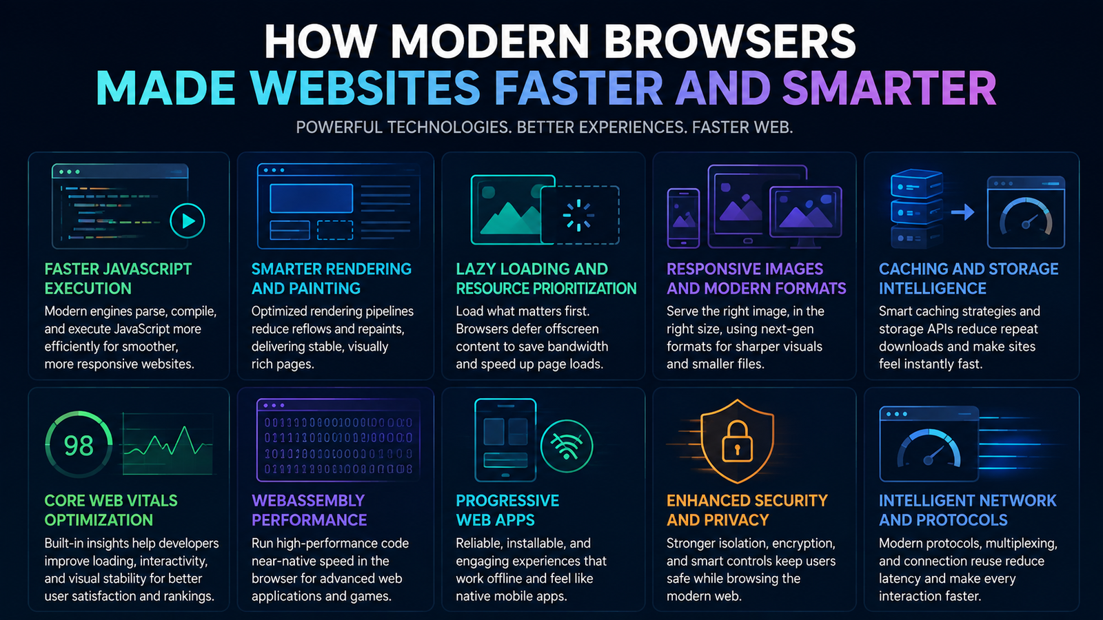
The biggest tech ideas that made the web move quicker included broadband, fiber optics, stronger mobile networks, content delivery networks, caching, file compression, HTTP/2, HTTP/3, modern image formats, edge computing, faster JavaScript engines, lazy loading, service workers, and WebAssembly. Some of these technologies increased the amount of data a connection could carry. Others reduced the distance data had to travel, removed repeated downloads, made files smaller, or helped browsers process code more efficiently. The modern web feels fast because all these improvements work together across networks, servers, websites, and browsers.
Why Did the Web Need to Become Faster?

The first websites were remarkably simple. Most contained text, a handful of links, and perhaps one or two small images. They did not need to manage video players, payment systems, live maps, customer accounts, or interactive dashboards.
Even these simple pages could be slow because early internet connections carried very little data. Browsers had basic rendering systems, servers were often located far from the visitor, and older communication protocols were not designed for the number of files found on a modern page.
Then the web grew up.
Websites became online stores, newsrooms, entertainment platforms, classrooms, banking systems, and business workspaces. A single page could contain HTML, CSS, JavaScript, images, fonts, advertisements, analytics tools, videos, and information pulled from several external services.
The old systems were no longer enough. A connection designed for reading a simple page could not comfortably support video calls, cloud software, live navigation, or high quality streaming. The web needed more capacity, but it also needed to become more intelligent.
Speed became especially important as people began using phones as their main way to access the internet. A website that felt acceptable on a powerful office computer could feel painfully slow on a budget phone using an unstable mobile connection.
Users also became less patient. Once some websites began loading quickly, every slow experience felt worse by comparison. Speed stopped being a pleasant bonus. It became part of what people expected from the web.
What Actually Makes a Website Feel Fast?
Website speed is not one simple measurement. Several things happen between the moment you tap a link and the moment you can comfortably use the page.
Bandwidth describes how much data a connection can carry during a particular period. You can think of it as the width of a road. A wider road can carry more traffic, but that does not guarantee that every car will reach its destination immediately.
Latency describes how long it takes information to travel between your device and a server. This is closer to the length of the journey. A wide road will not completely solve the problem if the destination is thousands of miles away.
Loading time measures how long the page and its resources take to arrive. A page with enormous images, several videos, and unnecessary scripts can still load slowly on a fast connection because the browser has so much information to download.
Rendering speed describes how quickly the browser can turn that information into something you can see. The browser must read the HTML, understand the styles, run scripts, calculate the layout, and paint the finished result onto the screen.
Responsiveness measures what happens after the page becomes visible. A website may appear quickly but still feel slow if buttons take too long to respond, menus freeze, or typing into a form produces a noticeable delay.
This is why paying for faster internet does not automatically make every website fast. Your connection may be excellent, but a distant server, oversized files, weak hosting, excessive scripts, or poor browser performance can still create delays.
A genuinely fast experience depends on the complete journey. The connection must be capable, the server must respond quickly, the files must be efficient, and the browser must know what to process first.
The 18 Tech Ideas That Made the Web Move Quicker
The most important web speed innovations did not all solve the same problem. They improved different parts of a connected system.
Some strengthened the physical infrastructure carrying information around the world. Some reduced the distance between users and website content. Others changed how browsers and servers communicate.
Several ideas focused on sending fewer bytes. Compression made files smaller. Caching stopped browsers from repeatedly downloading the same resources. Modern image formats delivered strong visual quality without forcing users to carry unnecessary data.
Browser improvements were equally important. Faster JavaScript engines made complicated applications practical. Better rendering systems displayed pages more efficiently. Smarter loading techniques helped browsers focus on what the visitor needed first.
The real breakthrough was not one clever invention. It was the way these technologies began working together. A faster network is useful, but it becomes far more powerful when it carries compressed files from a nearby server using an efficient protocol.
Faster Connections Created the Foundation
Before developers could create rich online experiences, the underlying internet connection needed to improve. The web could not become a serious platform for streaming, commerce, communication, and cloud software while every user remained trapped behind a painfully narrow connection.
Faster connections gave the web room to expand. They allowed websites to carry more information while giving engineers time to improve how that information was stored, delivered, and displayed.
1. Broadband Replaced Dial Up Internet
Dial up internet connected through a traditional telephone line. Users often had to wait while the modem established a connection, complete with the unforgettable electronic noise that defined the early online era.
The telephone line normally could not be used for regular calls while the computer was connected. The connection was also fragile. A dropped signal could interrupt a download and force the user to begin again.
Broadband changed that experience by providing a faster, more stable, and continuously available connection. DSL and cable services allowed households and businesses to remain connected without repeating the dialling process every time someone wanted to visit a website.
That continuous connection was just as important as the additional speed. The internet began to feel like a service that was always present rather than a destination users had to enter deliberately.
Broadband also gave developers permission to think bigger. Websites could include more images, richer designs, larger downloads, and interactive features. Video became practical. Online music grew. Software updates could be downloaded rather than purchased on a physical disc.
Streaming platforms, cloud storage, video calls, and browser based business software all depend on the capacity broadband helped introduce. Without that foundation, many of the later tech ideas that made the web move quicker would have had limited room to shine.
Broadband did not solve every performance problem. A badly designed website could still be slow. However, it removed one of the largest physical restrictions holding the early web back.
2. Fiber Optics Increased Internet Capacity
Traditional copper connections carry information through electrical signals. Fiber optic cables take a different approach. They send information using pulses of light through extremely thin strands of glass or plastic.
That change allows fiber networks to carry enormous amounts of data over long distances. It also makes them better suited to the growing demands placed on the modern internet.
Think about what happens inside an ordinary home today. One person may be attending a video meeting while another watches a high quality film. Someone else may be playing an online game, downloading a large update, or backing up photographs to cloud storage.
Older connections could struggle when several data heavy activities happened at once. Fiber gave homes and businesses far more breathing room.
Fiber also strengthened the hidden backbone of the internet. It connects cities, countries, data centers, mobile towers, and major network exchange points. Even when you are browsing through a wireless connection, part of your data journey may still take place through fiber optic infrastructure.
Greater capacity helped the web support far more than traditional pages. It made high resolution streaming, remote collaboration, online gaming, cloud applications, and large scale data transfers feel normal.
Fiber also improved consistency. Raw speed looks impressive in an advertisement, but stability matters just as much when you are making a video call, processing a payment, or working inside an online document.
The result was not simply a web that downloaded faster. It was a web that could support more people, more devices, and more demanding services at the same time.
3. Mobile Networks Took the Faster Web Everywhere
Broadband made the web faster inside homes and offices. Mobile networks carried that progress into streets, vehicles, shops, schools, and almost anywhere a phone could receive a signal.
Early mobile internet was limited. Pages had to be extremely light, images were often reduced, and video was rarely practical. Mobile websites sometimes felt like stripped down copies of the desktop experience because the connection could not comfortably handle much more.
Third generation mobile networks made basic browsing, email, navigation, and social media more useful. They helped the internet become portable, even if loading larger pages could still require patience.
Fourth generation networks changed expectations. Faster downloads and lower delays made mobile video, live navigation, social applications, online shopping, and video calls far more reliable. Businesses could no longer treat the mobile website as an afterthought.
Fifth generation networks pushed the mobile experience further. They offered greater capacity and improved support for crowded areas filled with connected devices. This mattered in places such as airports, stadiums, shopping centers, and busy city districts where thousands of people might be online at once.
The biggest change was cultural. People stopped thinking of the internet as something tied to a desk. The web became a constant companion, ready whenever someone needed directions, entertainment, a product comparison, or an immediate answer.
That expectation now extends to the smallest everyday problem. If your headphones stop connecting while you are travelling, you expect to find a clear guide explaining how to reset TOZO earbuds within seconds. You do not want to wait until you return to a desktop computer.
Stronger mobile networks also forced websites to improve. A page had to work across different screen sizes, processors, browsers, and connection conditions. Developers began paying closer attention to responsive layouts, lighter images, simpler navigation, and smarter loading decisions.
Mobile networks did not remove every limitation. Signal strength can change, crowded towers can reduce performance, and not every user owns a powerful phone. This is why efficient website design still matters.
The faster mobile web succeeded because better networks and smarter websites moved forward together. One provided the capacity. The other used that capacity carefully.
Bringing Websites Closer to Their Visitors

A faster connection cannot completely remove the delay caused by distance. If a visitor in Pakistan must request every image and script from a server in North America, that information still has a long journey to complete.
CDNs, cloud computing, and edge computing addressed this problem in different ways. They distributed files, infrastructure, and processing power across many locations instead of forcing the entire web to depend on distant central servers.
4. Content Delivery Networks Reduced Distance
A Content Delivery Network, usually called a CDN, keeps copies of website resources on servers located in different parts of the world. These resources can include images, videos, fonts, JavaScript files, and style files.
When someone visits a website, the CDN tries to serve those files from a location close to that person. A visitor in London might receive content from a European server, while a visitor in Karachi could receive the same content from an Asian location.
This shorter journey reduces latency. The browser spends less time waiting for files to travel between distant countries, which can make images appear sooner and pages feel more responsive.
A CDN also reduces pressure on the website’s original server. Instead of one machine answering every request, nearby CDN locations handle a large portion of the traffic.
This distribution becomes especially valuable when a website suddenly attracts thousands of visitors. A news article may go viral, an online store may begin a major sale, or a video may receive unexpected attention. The CDN spreads those requests across its network instead of allowing one server to become overwhelmed.
CDNs can also improve reliability. If one location experiences a technical problem, traffic may be redirected to another available location. This helps websites remain accessible during equipment failures or unusually busy periods.
The idea is simple. Do not make every visitor travel to one digital warehouse. Place useful copies closer to the people who need them.
5. Cloud Computing Made Websites Easier to Scale
Traditional websites often depended on one physical server. That machine stored the files, processed requests, and delivered pages to every visitor.
This arrangement worked until traffic grew beyond what the server could handle. If the machine ran out of memory, experienced a hardware failure, or received too many requests, the entire website could slow down or disappear.
Cloud computing replaced this rigid model with flexible infrastructure. A website could use computing power, storage, and databases across a collection of connected machines rather than depending entirely on one box in one room.
That flexibility made scaling much easier. When visitor numbers increased, the cloud platform could provide additional resources. When demand returned to normal, those extra resources could be reduced.
Imagine an online shop preparing for a major seasonal sale. On an ordinary day, it may serve a few thousand visitors. During the sale, that number could increase dramatically within minutes.
A fixed server might struggle under the pressure. Cloud infrastructure can distribute the traffic across several machines, allowing more customers to browse products, sign in, and complete payments at the same time.
Cloud computing also improves resilience. Information can be copied across machines and locations. If one machine stops working, another can continue serving visitors while the problem is repaired.
This does not mean every cloud website is automatically fast. Poorly written code, slow databases, and weak configuration can still cause delays. The cloud simply gives website owners a more flexible foundation on which to build.
6. Edge Computing Moved Work Closer to Users
A CDN usually improves speed by storing copies of files close to visitors. Edge computing takes the same geographic idea and applies it to processing.
Instead of only keeping an image or script nearby, an edge system can run parts of the website’s logic near the user. This reduces the number of requests that must travel back to a distant central data center.
Consider a website that changes its content according to a visitor’s general location. Without edge computing, the request may travel to the main server, wait for a decision, and then return with the correct version of the page.
An edge location can sometimes make that decision much closer to the visitor. It can identify the relevant region, apply a simple rule, and return the appropriate response without completing the full journey to the origin.
Edge computing can also support security checks. Suspicious traffic may be filtered before it reaches the main application. This protects central infrastructure while reducing unnecessary work.
Personalization, redirects, access rules, application programming interface requests, and simple data processing can also happen at the edge. The exact tasks depend on the platform and the needs of the website.
The difference is important. A CDN brings stored content closer. Edge computing brings both content and selected decision making closer.
Cloud infrastructure provides flexible computing across large data centers. Edge computing extends some of that power into more locations. Working together, they help websites respond quickly without giving up the scale of a central cloud system.
Smarter Internet Protocols Reduced Waiting

Faster connections and nearby servers solve only part of the problem. Browsers and servers also need an efficient way to communicate.
Internet protocols define how connections begin, how resources are requested, how information is divided, and what happens when part of the transfer goes wrong. Improving these rules made the web faster without requiring every website file to become smaller.
7. HTTP/2 Allowed More Resources to Travel Together
A modern webpage is rarely one complete file. The browser may need to request HTML, several style files, multiple scripts, fonts, icons, advertisements, and dozens of images.
Older HTTP communication was not designed for this level of complexity. Browsers often opened several connections to collect resources, but each connection created additional work and delay.
HTTP/2 introduced multiplexing. This allowed multiple streams of information to travel through a single connection at the same time.
Imagine a road that once allowed only one delivery vehicle to move through a gate at a time. HTTP/2 redesigned the gate so several organized deliveries could move through it together.
An image no longer needed to wait for a style file to finish before beginning its journey. Scripts, fonts, and other resources could share the connection more efficiently.
HTTP/2 also compressed request and response headers. These headers carry instructions and details about each communication. Reducing their size saved bandwidth, especially on pages making many requests.
The improvement did not remove every delay. HTTP/2 still relied on TCP, where a lost packet could hold up progress across the connection. However, it represented a major improvement over the older request pattern.
8. HTTP/3 and QUIC Improved Unstable Connections
HTTP/3 continued the work started by HTTP/2, but it changed the transport system underneath the communication.
It uses QUIC, a modern transport protocol built to support secure and efficient connections. QUIC manages multiple streams while reducing the disruption caused when information is lost during transfer.
With older TCP based communication, one missing packet could delay several streams sharing the same connection. QUIC separates those streams more effectively. If information belonging to one stream is delayed, unrelated streams can often continue moving.
This matters on mobile networks. A phone may move between a home wireless connection and mobile data. Signal quality can rise and fall as the user walks, drives, or enters a crowded area.
QUIC also supports connection migration. This can help a connection continue when the device changes networks rather than forcing the entire communication process to begin again.
HTTP/3 includes QPACK for field compression. QPACK reduces the size of HTTP fields while giving implementations control over compression related blocking and latency. These behaviors are defined in the official HTTP/3 standard.
The practical benefit is a web that can remain responsive when the connection is imperfect. HTTP/3 cannot repair a weak signal, but it can use that signal more intelligently.
9. TLS 1.3 Made Secure Connections Faster
Secure websites protect information as it travels between the browser and server. This encryption is essential for passwords, payments, private messages, and ordinary browsing.
Before encrypted information could move, the browser and server had to establish a secure connection. Older versions of Transport Layer Security required several communication steps before useful data could begin travelling.
Each step added another round trip. If the server was far away or the network had high latency, these repeated journeys created a noticeable delay.
TLS 1.3 simplified the process. A normal new connection can establish encryption with fewer round trips than older versions required.
Returning visitors may also benefit from connection resumption, which allows the browser and server to reuse information from an earlier secure session. In appropriate situations, this reduces setup time further.
The change proved that security and speed did not need to be enemies. TLS 1.3 removed older cryptographic options while improving how quickly modern secure connections could begin.
Visitors may never see this process, but it happens behind the familiar lock symbol in the browser. Faster secure setup helped encrypted browsing become the normal foundation of the web.
10. Smarter Congestion Control Used Networks Better
Internet connections are shared systems. Too much data sent too quickly can overwhelm part of the route and create congestion.
Congestion control determines how quickly a sender should transmit information. The challenge is finding a balance. Sending too slowly wastes available capacity, while sending too quickly can cause packet loss and longer delays.
Traditional congestion control often treated packet loss as evidence that the network was overloaded. That approach was useful, but it could struggle on wireless connections where information might be lost for reasons unrelated to congestion.
Systems such as BBR take a different approach. BBR estimates the bottleneck bandwidth and the time required for data to complete a round trip.
In simpler words, it tries to understand how much information the route can carry and how long that journey normally takes. It then adjusts the sending pace to use available capacity without creating an unnecessary queue.
This is like managing traffic entering a busy tunnel. If too many vehicles enter at once, they form a jam. If too few enter, useful road space remains empty. Smarter control aims to keep traffic moving steadily.
Visitors do not choose the congestion system used by a server. Still, these improvements can support better downloads, smoother streaming, and more stable performance across long distance or mobile connections.
Sending Less Data Made Pages Lighter

One way to make the web faster is to build bigger networks. Another is to send less information through them.
Modern performance techniques reduce unnecessary file weight before content reaches the visitor. Smaller pages can load faster, consume less mobile data, and place less pressure on servers and networks.
11. Gzip and Brotli Compression Shrunk Website Files
HTML, CSS, and JavaScript often contain repeated words, patterns, and characters. Compression finds efficient ways to represent that information using fewer bytes.
Gzip became one of the standard methods for compressing website files. A server could shrink a text file before sending it, and the browser could restore it after receiving it.
Brotli offered another compression option designed with web content in mind. It can often create smaller text files than Gzip, although the final result depends on the content and compression settings.
Think of packing for a trip. Your clothes do not disappear when you compress them into a suitcase. You simply fold and arrange them so they occupy less space during the journey.
Website compression works in a similar way. The HTML, CSS, and JavaScript still contain the same instructions when they reach the browser. They are simply packed more efficiently while travelling across the network.
The visitor does not need to manually open anything. Modern browsers handle decompression automatically.
The savings from one file may appear small, but a popular website can serve millions of files. Reducing each transfer lowers bandwidth use and shortens loading time across an enormous number of visits.
12. WebP and AVIF Made Images Smaller
Images can be among the heaviest resources on a webpage. A beautifully designed page may still feel slow if it forces every visitor to download several enormous photographs.
Traditional formats such as JPEG and PNG remain useful, but newer formats can store many images more efficiently.
WebP supports both lossy and lossless compression. It can often produce a smaller file while preserving visual quality suitable for the web.
AVIF can provide even stronger compression for certain images. It also supports features such as transparency and a wide range of colours.
Choosing a modern format is only part of the solution. A website should also serve an image that matches the visitor’s device.
A small phone does not need the same enormous image prepared for a large desktop monitor. Responsive image markup allows the browser to select an appropriate version based on screen size, resolution, and layout.
Loading priority matters too. The main image visible at the top of a page may need to arrive quickly. An image near the bottom can wait until the visitor scrolls closer to it.
MDN recommends modern formats, responsive images, careful priorities, and delayed loading for content outside the initial view. These techniques are covered in its image performance guidance.
The goal is not to make every image look worse. It is to stop sending more visual data than the visitor can actually use.
13. Minification, Tree Shaking, and Code Splitting Reduced Waste
Website code is normally written for people to read and maintain. Developers use spaces, comments, and descriptive formatting to keep their work understandable.
Browsers do not need all that visual organization. Minification removes unnecessary spaces, comments, and characters from production files.
The code continues to perform the same job, but the file becomes smaller. It is similar to removing empty packaging before shipping a product.
Tree shaking deals with unused code. A website may depend on a large software library while using only a small part of it. Tree shaking identifies code that the final application does not need and removes it from the production package.
Code splitting addresses another problem. Instead of forcing the visitor to download the entire application immediately, developers divide the code into smaller pieces.
The browser can load the code required for the current page first. Additional code arrives when the visitor opens another section or uses a particular feature.
These methods reduce the amount of work performed during the first visit. Less code needs to travel, less code needs to be parsed, and less code needs to run before the page becomes useful.
14. Lazy Loading and Resource Priorities Loaded the Right Things First
A long webpage may contain dozens of images, embedded videos, comment sections, and interactive tools. Most of these resources are not visible when the page first opens.
Loading everything immediately wastes bandwidth and forces important content to compete with resources the visitor may never see.
Lazy loading delays selected images, videos, or code until they move closer to the visible part of the screen. If the visitor never reaches that section, the browser may never need to download the resource.
This gives the browser more room to load the heading, main image, introduction, and essential controls first.
Preload works in the opposite direction. It tells the browser that a particular resource is important and should be requested early.
Fetch priority provides another useful signal. It helps the browser understand that one image or request deserves more attention than another.
These tools must be used carefully. Lazy loading the main visible image can make the page feel slower. Preloading too many files can turn every resource into a supposed priority, which defeats the purpose.
The best strategy is selective. Load what the visitor needs now. Prepare what they are likely to need soon. Delay what can safely wait.
MDN identifies lazy loading, speculative loading, and critical rendering path optimization as important parts of modern web performance.
Browsers Became Faster and Smarter
Servers and networks can deliver information quickly, but the browser must still turn that information into a useful experience.
Modern browsers became far better at processing JavaScript, calculating layouts, painting graphics, saving resources, and deciding what to load first. These improvements helped websites behave more like full applications.
15. AJAX Removed Unnecessary Page Reloads
Older websites often refreshed the complete page after even a small action. Submitting a form, requesting search results, or changing a setting could make everything disappear and load again.
AJAX changed that pattern by allowing a webpage to communicate with a server in the background. The browser could request new information and update one part of the page without rebuilding everything.
The name originally referred to Asynchronous JavaScript and XML, although modern websites commonly exchange information in other formats such as JSON.
Live search became smoother because suggestions could appear as the visitor typed. Maps could load new areas without refreshing the complete screen. Email platforms could display new messages while keeping the inbox open.
Social feeds, online stores, booking systems, and business dashboards all benefited from this approach. Modern browser tools such as Fetch continued the same basic idea with cleaner ways to make background requests.
These improvements also changed how people explore online information. Interactive pages can retrieve specific details without forcing the reader through repeated full page loads. This supports useful tools and guides for tasks such as discovering how to find the exact time a video was uploaded.
AJAX did not necessarily make every individual request faster. It made the overall experience more efficient by updating only what needed to change.
16. Faster JavaScript Engines Made Web Applications Possible
JavaScript gives websites much of their interactive behaviour. It manages menus, forms, editors, animations, live updates, and countless other features.
Early JavaScript engines processed code more slowly. That was acceptable when scripts handled a few simple actions, but it became a serious limitation as websites grew into complicated applications.
Modern engines use several techniques to improve performance. They interpret code, compile frequently used parts, observe how the program behaves, and optimize important instructions while the application runs.
V8 helped push this evolution forward. It is the JavaScript and WebAssembly engine used in Chrome and Node.js. You can read its technical overview on the official V8 website.
Other browsers developed their own advanced engines. This competition helped JavaScript execution improve across the web.
Faster engines made browser based spreadsheets, design tools, video editors, document platforms, and business software practical. Tasks that once required an installed desktop program could now run inside an ordinary browser tab.
More power also created a temptation to send excessive JavaScript. A fast engine cannot completely rescue an application buried under unnecessary code. Developers must still control file size and avoid blocking the browser with long tasks.
17. Better Rendering Engines Displayed Pages More Efficiently
A browser does not receive a completed visual page. It receives instructions and resources that must be assembled.
The browser reads the HTML to understand the content. It processes the CSS to understand the appearance. It runs JavaScript that may change the content, design, or behaviour.
From that information, the rendering engine creates structures representing the page. It calculates where elements belong, paints their visual details, and combines the finished layers into the image shown on the screen.
Modern rendering engines improved nearly every part of this process. They became better at performing suitable work in parallel, using graphics hardware, avoiding unnecessary recalculations, and updating only the parts of a page that changed.
Graphics acceleration allowed certain visual tasks to move from the central processor to the graphics processor. This supported smoother animations, scrolling, video, and complex visual effects.
Developers also learned to improve the critical rendering path. This means helping the browser reach visible content without being blocked by unnecessary style files, scripts, or request chains.
However, the browser cannot make every design decision free. Complicated layouts, constant visual changes, and poorly managed animations can still create extra work.
The fastest rendering engine performs best when the website gives it clean instructions and sensible priorities.
18. Service Workers, Progressive Web Apps, and WebAssembly Expanded Browser Performance
Service workers introduced a programmable layer between a website and the network. They can respond to requests, manage selected cached resources, and support background activity.
For repeat visits, a service worker may provide saved files without waiting for the network. This can make parts of a website appear quickly, even when the user has a weak connection.
Service workers also support offline experiences. A news application might keep previously opened stories available. A business tool could preserve its basic interface while waiting for fresh information.
Progressive Web Apps build on capabilities such as service workers, caching, responsive design, and installation support. They remain web experiences, but they can feel closer to applications installed directly on a device.
A PWA may open from a home screen, work reliably across changing connections, send notifications with permission, and maintain a consistent application shell.
WebAssembly expands what browsers can process efficiently. It provides a compact instruction format that can support code created from languages beyond JavaScript.
This is valuable for demanding work such as image processing, video editing, data visualization, gaming, scientific tools, and design software.
WebAssembly does not replace JavaScript. The two can work together. JavaScript can manage the interface and ordinary web behaviour, while WebAssembly handles selected tasks that benefit from efficient computation.
Together, service workers, Progressive Web Apps, and WebAssembly helped the browser move beyond its original role as a document viewer. It became a capable platform for fast, reliable, and increasingly sophisticated software.
How These Technologies Work Together During One Page Visit

You tap a link. It feels like one simple action, but an entire chain of technologies immediately begins working behind the screen.
Your internet connection provides the road. Broadband, fiber, or a mobile network gives your device the capacity required to send and receive information. A stronger connection can carry more data, but it still needs to know where that data should go.
The browser begins with the website address. People understand a name such as eadoz.com, but computers communicate using numerical addresses. The Domain Name System, usually called DNS, translates the readable domain into the address of the server or network responsible for the website.
You can think of DNS as the contact list of the internet. You choose a name, and DNS finds the number needed to begin the conversation.
The request may not travel to the website’s original server. A Content Delivery Network checks whether it can answer from a location closer to you.
If you are visiting from Karachi, the CDN may deliver website files from a nearby Asian location instead of sending every request to a server on another continent. That shorter physical journey reduces latency.
The browser and server then establish a secure connection. HTTP/3 and QUIC help manage this communication efficiently, particularly when the network is unstable or the device changes between connections.
The server begins sending the page. However, it does not necessarily send every file at its original size.
Gzip or Brotli may compress the HTML, CSS, and JavaScript. The information remains complete, but it travels in a smaller package.
Images may arrive in WebP or AVIF rather than a heavier traditional format. Responsive image rules help the browser choose a version that suits the visitor’s screen instead of downloading an enormous desktop image for a small phone.
Caching can make the process even shorter. If you have visited the website before, your browser may already possess the logo, fonts, style files, or other resources.
The browser checks whether those saved files are still usable. If they are, it can reuse them without downloading fresh copies. A CDN may also reuse cached resources instead of contacting the original server.
Now the browser must decide what to handle first. It reads the HTML to understand the content and examines the CSS to determine how that content should look.
Important resources receive priority. The main heading, visible text, critical styles, and primary image may load first. Content far below the visible area can wait.
JavaScript begins running, but well designed pages avoid forcing every script to execute immediately. Nonessential code can be delayed until the page is already useful.
The rendering engine calculates where each element belongs. It paints the text, images, colours, buttons, and backgrounds before combining those pieces into the finished page you see.
The page may now look complete, but more work can continue quietly. Lazy loaded images may arrive when you scroll. AJAX requests may retrieve new information without refreshing the page. A service worker may save useful resources for your next visit.
All of this can happen within moments.
That is the real story behind a fast page. Broadband provides capacity. DNS finds the destination. A CDN reduces distance. HTTP/3 manages communication. Compression and modern formats reduce file weight. Caching prevents repeated work. The browser then prioritizes, processes, and displays the result.
No single technology creates the experience. Speed comes from the complete system working in the correct order.
Which Ideas Made the Biggest Difference?
It is tempting to choose one invention and call it the breakthrough that made the modern web possible. The honest answer is less dramatic and far more interesting.
Different technologies solved different limitations. Removing one piece would weaken the entire experience.
Broadband and fiber created the physical foundation. Without greater network capacity, streaming services, video meetings, cloud storage, and browser based software could not operate as smoothly as they do today.
However, bandwidth alone did not remove distance. A powerful connection could still feel slow if every request had to travel to a server located thousands of miles away.
CDNs addressed that problem by storing resources closer to visitors. They reduced geographic delay while helping websites manage global audiences and sudden traffic increases.
Cloud computing gave websites flexible infrastructure. Instead of depending entirely on one physical machine, applications could distribute work, add resources during busy periods, and continue operating when individual machines failed.
Edge computing brought selected decisions closer to the user. It extended the local delivery idea beyond static files and into application logic, security, and personalization.
HTTP improvements changed how browsers and servers communicated. HTTP/2 allowed many streams to share a connection. HTTP/3 and QUIC made that communication more resilient when packets were lost or connections changed.
Compression made better use of every network. Gzip and Brotli reduced the size of text files, while WebP and AVIF helped reduce the weight of images.
Caching prevented repeated downloads. This was one of the simplest but most powerful improvements because the fastest transfer is often the one that does not need to happen.
Browser advances completed the picture. Faster JavaScript engines, better rendering systems, service workers, and WebAssembly allowed sophisticated software to run inside an ordinary browser.
So, which of the tech ideas that made the web move quicker mattered most?
Broadband and fiber may deserve credit for creating the road. CDNs shortened the journey. Modern protocols organized the traffic. Compression reduced the luggage. Caching remembered what had already arrived. Browsers turned the delivery into a useful experience.
Choosing one winner misses the point. The modern web became fast because these ideas solved different parts of the same problem.
The Difference Between Actual Speed and Perceived Speed
Actual speed describes what the technology is doing. It measures how quickly a server responds, how fast files travel, how long scripts take to execute, and how soon the browser finishes its work.
Perceived speed describes what the visitor feels.
A page might need three seconds to complete every background task, but the visitor may feel that it loaded quickly if useful content appeared during the first second.
The reverse can also happen. A website may download most of its files quickly but leave the visitor staring at a blank screen. Technically, the network performed well. Emotionally, the website felt slow.
This is why modern performance work focuses on more than the final loading time.
Loading priorities help the browser display the most important content first. The main heading, introduction, navigation, and visible image usually matter more than a social media widget near the bottom of the page.
Skeleton screens can also improve perceived speed. These simple placeholder shapes show where content will appear while the real information is loading.
A skeleton screen does not reduce the size of a file or increase bandwidth. It reduces uncertainty. The visitor can see that the page is responding and understand what is about to appear.
Partial updates create a similar effect. AJAX allows one part of a page to change without refreshing everything. A shopping cart can update its total while the product page remains visible.
Cached responses can make repeat visits feel almost immediate. The browser may display saved content first and check for an updated version in the background.
Perceived speed should never become an excuse to hide genuinely poor performance. A loading animation cannot repair a page that sends enormous files or freezes after every click.
The strongest websites improve both sides. They reduce actual transfer and processing time while giving visitors useful visual progress.
Real speed handles the technical delay. Perceived speed handles the human experience of waiting.
How Web Performance Is Measured Today
You cannot improve website speed reliably by guessing. A page may feel quick on the developer’s computer but perform poorly for visitors using older phones or slower networks.
Modern performance testing examines several parts of the experience. It measures when the server responds, when content becomes visible, when the page responds to input, and whether the layout remains stable.
Core Web Vitals
Core Web Vitals focus on three parts of the user experience: loading, responsiveness, and visual stability.
Largest Contentful Paint, known as LCP, measures how quickly the largest important piece of visible content appears. This element may be a hero image, a heading, or a large text block.
In simple terms, LCP asks, “When does the page begin showing me the main thing I came to see?”
A good LCP should occur within 2.5 seconds. If the main content takes much longer, the visitor may feel that the page is still waiting to begin.
Interaction to Next Paint, known as INP, measures responsiveness. It looks at how quickly the page provides visible feedback after someone clicks, taps, or types.
A low INP means the page reacts promptly. A high INP may make buttons feel stuck, menus feel delayed, and forms feel frustrating.
The recommended INP target is 200 milliseconds or less.
Cumulative Layout Shift, known as CLS, measures visual stability. It tracks unexpected movement while the page is loading.
You may have tried to tap a button just as an advertisement appeared and pushed everything downward. That irritating jump is exactly the kind of problem CLS is designed to identify.
A good CLS score is 0.1 or less.
These targets should be met at the seventy fifth percentile of page visits. This means a website should provide a good experience for at least three quarters of the measured visitors, rather than performing well only under ideal conditions.
The current targets and measurement approach are explained in the official Web Vitals guidance.
Other Useful Performance Measurements
Core Web Vitals are important, but they do not explain every possible delay.
Time to First Byte measures how long the browser waits before receiving the first byte of the response. It can reveal problems involving hosting, server processing, databases, redirects, or network distance.
A slow Time to First Byte means the browser is waiting before it can seriously begin building the page.
First Contentful Paint measures when the first visible piece of content appears. This might be text, an image, or another page element.
This measurement helps determine whether visitors see progress quickly or remain stuck with a blank screen.
Total page weight measures the amount of data transferred during the visit. Large pages can be difficult for mobile users, especially when they contain oversized images, video, or excessive JavaScript.
Request count measures how many separate resources the browser needs. A page may request images, fonts, scripts, style files, advertisements, analytics tools, and information from external services.
A high request count is not automatically bad. HTTP/2 and HTTP/3 can manage many requests efficiently. However, every unnecessary request still adds work.
Server response time measures how quickly the website’s infrastructure processes a request. Slow application code, overloaded hosting, or inefficient database queries can increase this delay.
No single measurement tells the complete story.
A page can have a strong LCP but respond poorly when clicked. It can have a small total page weight but wait too long for the server. It can load quickly but shift so much that using it becomes difficult.
Performance needs to be read as a collection of signals.
Laboratory Data and Real Visitor Data
Laboratory testing measures performance under controlled conditions. A tool may load the page using a particular device profile, connection speed, browser, and geographic location.
This controlled environment makes comparison easier. A team can test the website before and after a change to see whether performance improved.
Laboratory testing is particularly helpful during development. It can reveal render blocking resources, oversized images, excessive JavaScript, long tasks, and request chains.
However, laboratory testing represents a simulation. Real visitors rarely use the same device, connection, location, and browsing behaviour.
One person may visit through a new laptop connected to fiber. Another may use an older phone on a crowded mobile network. Someone else may arrive from a country far from the website’s main server.
Real visitor data records what happens during actual visits. It shows performance across different devices, browsers, connections, and locations.
This information can reveal problems that a controlled test misses. A page may perform beautifully in the laboratory but struggle for visitors using lower powered phones.
The best approach uses both.
Laboratory data helps diagnose technical problems and test potential fixes. Real visitor data shows whether those fixes improve the experience people actually receive.
One tells you what could happen under specific conditions. The other tells you what is happening across the real audience.
Why Are Some Modern Websites Still Slow?
Modern websites have access to faster networks, better protocols, global CDNs, powerful browsers, and advanced optimization tools. Yet many pages still feel frustratingly slow.
The problem is rarely a complete absence of technology. More often, the website uses that technology poorly.
Oversized images remain one of the most common causes. A page may download a huge photograph even though the visitor sees it inside a small content box.
Excessive JavaScript creates another problem. Large script files take time to download, parse, compile, and execute. They can also block the browser from responding to user input.
Advertising scripts add requests and processing work. A single page may contact several advertising networks, tracking platforms, bidding systems, and measurement services before it becomes stable.
Weak hosting can delay the first server response. If the server is overloaded or located far from the audience, the browser may spend valuable time waiting before receiving any useful content.
Missing caching forces visitors to download unchanged resources repeatedly. The same logo, font, or style file may travel across the network during every visit even though it could have been stored and reused.
External services can quietly damage performance. A website may be fast on its own but depend on a slow analytics platform, chat widget, embedded video, social feed, or payment service.
Fonts can also cause trouble. A complicated collection of font families and weights increases file size and may delay the moment text becomes visible.
Poor mobile design makes all these problems worse. A powerful desktop computer may hide inefficient code that overwhelms a budget phone.
Some websites also try to load everything immediately. Every image, video, comment, recommendation, and tracking script competes for attention during the first few seconds.
The modern web provides excellent tools for speed, but those tools do not apply themselves. Website owners still need to compress files, configure caching, control scripts, prioritize visible content, test mobile performance, and monitor real visitors.
A fast web is possible. A fast individual website still requires deliberate decisions.
How Faster Websites Support SEO and Better Content
A visitor arrives with a question. Your content may contain the perfect answer, but that answer has little value if the page takes too long to appear, jumps around while loading, or freezes when the visitor tries to use it.
Speed removes friction between the search and the answer. It helps readers reach the heading, explanation, image, product, or instruction they came to find.
This is where technical performance and content quality meet.
A fast website with weak content will not satisfy the reader. A brilliant article trapped inside a slow and confusing page may never receive the attention it deserves. Strong results come from combining useful information with a smooth experience.
Clear structure plays an important role. Descriptive headings help readers scan the page and move directly to the section that matches their question.
Short paragraphs make complicated information easier to process, especially on a phone. Relevant images can support the explanation, provided they are compressed and loaded carefully.
Search intent matters just as much. A visitor looking for a quick definition should not need to fight through a long sales pitch. Someone searching for a detailed guide needs depth, examples, and a logical path through the topic.
Website speed supports this journey. It allows the right content to appear quickly and respond when the reader wants to explore further.
Performance can also support search visibility. Search engines want to guide people toward pages that are relevant, useful, accessible, and practical to use.
However, speed is not a replacement for relevance. A fast page with inaccurate or thin information will not automatically outrank a slower page that answers the question properly.
The better strategy is to connect both sides. Build pages around genuine search intent, write useful content, organize it clearly, and deliver it through a fast technical foundation.
That combination sits at the heart of a strong SEO content strategy for blogs and articles. Content earns attention by answering the question. Performance helps the reader receive that answer without unnecessary frustration.
A Practical Web Speed Checklist for Website Owners
Web performance can look intimidating when every testing tool produces a long list of warnings. You do not need to fix everything at once.
Begin with the problems affecting real visitors. Measure what is happening, identify the largest delay, and make one meaningful improvement at a time.
Measure Before Changing Anything
Do not begin by randomly deleting plugins, changing hosting plans, or installing another optimization tool.
Start with evidence.
Use a performance testing tool to examine loading speed, responsiveness, visual stability, server delay, page weight, and request count. Then compare those results with real visitor data when it is available.
Look at mobile and desktop performance separately. A page that works beautifully on a laptop may struggle on a lower powered phone.
Test important page types rather than checking only the homepage. Product pages, blog posts, service pages, checkout screens, and landing pages may use different templates and resources.
Record the starting results before making changes. Without a baseline, you will not know whether an update improved the website or simply moved the problem somewhere else.
Focus on patterns. If several important pages share a slow hero image, delayed server response, or heavy script, that issue deserves attention before a minor warning found on one rarely visited page.
Measurement turns optimization from guesswork into a sensible process.
Optimize the Largest Visible Content
The first visible area creates the visitor’s immediate impression of speed. It usually contains the main heading, introduction, hero image, featured product, or another large content block.
Identify which element is likely to become the Largest Contentful Paint element. In many cases, it will be a large image or a prominent block of text.
If it is an image, make sure the browser can discover it early. Use an appropriate format, correct dimensions, and a compressed file.
Do not lazy load the main visible image. Lazy loading is useful for content farther down the page, but delaying the most important image can make the opening experience slower.
If the largest element is text, examine anything preventing it from appearing. A slow font, blocking style file, or script may delay the moment the browser can display it.
Keep the first visible section focused. A large background video, several decorative images, complicated animations, and multiple tracking scripts can create an impressive design that performs poorly.
Ask a simple question. What does the visitor need to see first?
Prioritize that element. Let everything less important wait.
Compress Images and Website Files
Images should be prepared for the space in which they will appear.
Do not upload one enormous image and force every device to download it. Create responsive sizes so the browser can choose a suitable version for the visitor’s screen.
Use modern formats such as WebP or AVIF when they suit the image and browser support requirements. These formats can reduce file size while preserving useful visual quality.
Compression should be balanced. The goal is not to create blurry photographs or unreadable graphics. It is to remove file weight that the visitor cannot see or use.
Text resources need attention too. HTML, CSS, and JavaScript can usually be compressed with Gzip or Brotli before travelling across the network.
Minification can remove unnecessary spaces, comments, and formatting from production files. Tree shaking can remove code the website never uses.
Review fonts as well. Loading several families, styles, and weights can quietly add considerable page weight. Keep only the versions the design genuinely needs.
Every saved byte matters more on a slow mobile connection. A lighter page loads sooner, consumes less data, and asks less from the visitor’s device.
Configure Caching Carefully
Caching allows browsers and shared systems to reuse previously stored responses.
A returning visitor may already have the website logo, fonts, scripts, and style files saved on their device. If those resources have not changed, downloading them again creates unnecessary work.
Browser caching stores resources for an individual user. Shared caching can store responses in systems between the visitor and the origin server, including proxies and CDNs.
The Cache Control header tells these systems how responses should be handled. It can define how long a resource remains fresh, whether it can be stored publicly, and when it must be checked again.
Static resources with versioned file names can often remain cached for a long time. When the file changes, the website can publish it under a new name or version.
Frequently updated content may need shorter caching periods or validation before reuse. Private account information needs especially careful rules so it is not accidentally stored inside a shared cache.
Caching should never be configured blindly. Keeping a resource for too little time wastes repeat downloads. Keeping it for too long can make visitors see outdated content.
MDN provides a detailed explanation of directives and caching behaviour in its Cache Control reference.
The best caching policy depends on the content. The principle remains simple: do not download an unchanged resource again when a safe and valid copy is already available.
Reduce Unnecessary JavaScript
JavaScript can create powerful experiences, but it is one of the easiest ways to make a website feel heavy.
The browser must download, parse, compile, and execute the code. A large script can therefore create several kinds of delay.
Begin by identifying code the website does not use. Old features, abandoned experiments, duplicated libraries, and unused plugin scripts can remain long after anyone remembers why they were added.
Remove what is unnecessary.
Next, examine when each script runs. A chat widget, social feed, analytics tool, or recommendation system may not need to execute before the main content appears.
Delay nonessential scripts until the page becomes useful. Load feature specific code when the visitor opens that feature rather than sending the entire application immediately.
Break long tasks into smaller pieces where possible. A browser cannot respond smoothly to clicks or typing while one script occupies the main thread for too long.
Pay close attention to external scripts. You may not control how efficiently an advertising network, tracking platform, or embedded tool writes its code.
Every external script should earn its place. If it adds little business or user value but creates a measurable delay, reconsider it.
Test the Website on Mobile Connections
Fast office internet can hide serious problems.
A developer may test a page on a powerful computer connected to fiber and conclude that everything works perfectly. The real visitor may be using an older phone on a crowded mobile network.
Test with limited bandwidth and increased latency. This reveals how the page behaves when resources take longer to arrive.
Use mobile device testing to examine processing performance as well. The network may deliver a script quickly, but a lower powered phone can still struggle to execute it.
Check whether text appears without waiting for a custom font. Make sure buttons are easy to tap and menus respond promptly.
Watch for layout shifts. Small screens make unexpected movement particularly frustrating because each element occupies a larger portion of the visible area.
Test images carefully. Mobile visitors should not receive enormous files designed for wide desktop monitors.
A mobile test should also reflect how people actually browse. They may be moving between networks, opening several applications, or using a device with limited memory.
If the website works well under difficult conditions, it will usually feel excellent under strong ones.
Monitor Performance After Every Major Update
Website speed is not a task you complete once and forget.
A new theme can change how styles and scripts load. A plugin can add code to every page even when its feature appears in only one section.
Tracking scripts, advertising platforms, chat tools, and social media embeds can create new requests. Design changes can introduce larger images, additional fonts, or complicated animations.
Even a content update can affect performance. Replacing a compressed hero image with a huge original file may damage loading time without changing the rest of the website.
Test performance after major changes. Compare the results with the baseline recorded earlier.
Monitoring also helps catch gradual decline. One small script may not create an obvious problem, but several additions over six months can turn a fast page into a heavy one.
Set reasonable performance limits for page weight, script size, image size, and important experience measurements.
When an update breaks those limits, investigate it before the slower experience becomes normal.
Performance is easier to protect than to recover after years of unchecked additions.
What Could Make the Web Even Quicker Next?
The next stage of web speed will probably come from better coordination rather than one magical invention.
Predictive loading is already changing when work begins. Instead of waiting for a click, browsers can prepare resources or pages that the visitor is likely to need next.
Used carefully, this can make navigation feel immediate. Used poorly, it can waste bandwidth by loading pages the visitor never opens. Better prediction will need to balance speed, data use, privacy, and device resources.
Edge computing will continue to move selected work closer to visitors. More personalization, security checks, redirects, and application logic may happen near the user instead of inside one distant data center.
This does not mean every application should move all its work to the edge. Databases, complex transactions, and central business rules may still belong in larger cloud systems.
The most effective architecture will decide which work benefits from proximity and which work benefits from central control.
Browser engines will also keep improving. Better scheduling, rendering, memory management, and JavaScript optimization can help complicated pages remain responsive.
Developers will still need discipline. A faster browser can process more work, but that should not become an excuse to send endless code.
Mobile networks will continue adding capacity and improving performance. Their real value will depend on coverage, affordability, device support, and how consistently users can access those improvements.
Media compression has room to develop as well. Better image and video formats can preserve visual quality while transferring fewer bytes.
This matters because the web continues to become more visual. Streaming, short videos, product photography, online learning, and interactive media all place pressure on networks and devices.
WebAssembly will continue expanding the types of work browsers can perform efficiently. It can support advanced design tools, media processing, games, data analysis, and scientific applications.
Its development will not make JavaScript irrelevant. The two technologies are likely to remain partners, each handling the work it performs best.
The future web may feel faster because it predicts carefully, processes work closer to the user, compresses media more efficiently, and uses device resources more intelligently.
Progress will be gradual, just as it was before. The web became fast through layers of improvement, and its next gains will probably follow the same pattern.
Frequently Asked Questions
What Are the Main Tech Ideas That Made the Web Move Quicker?
The main ideas include broadband, fiber optics, mobile networks, CDNs, cloud computing, edge computing, HTTP/2, HTTP/3, compression, caching, modern image formats, lazy loading, faster JavaScript engines, service workers, and WebAssembly.
These technologies improved different parts of the journey. Some increased capacity, some reduced distance, some made files smaller, and others helped browsers process and display pages more efficiently.
Did Faster Internet Connections Solve Every Web Speed Problem?
No. A faster connection provides more bandwidth, but bandwidth is only one part of performance.
A website can still feel slow because of distant servers, high latency, oversized images, excessive JavaScript, poor caching, weak hosting, or slow external services.
Fast internet gives the website a better road. The website still needs to pack and manage its traffic properly.
How Do CDNs Make Websites Load Faster?
A CDN stores website resources across a network of locations.
When someone visits the website, files can be delivered from a nearby location rather than one distant origin server. This shorter journey reduces latency.
CDNs also distribute traffic, reduce pressure on the main server, and help websites remain stable during busy periods.
What Is the Difference Between HTTP/2 and HTTP/3?
HTTP/2 allows several streams of information to share one connection efficiently. This helps browsers request many images, scripts, fonts, and style files without relying on numerous separate connections.
HTTP/3 carries HTTP communication over QUIC. It improves how multiple streams are handled when packets are lost and works particularly well across unstable or changing networks.
Both improve efficiency, but HTTP/3 is designed around a newer transport foundation.
Why Does Caching Make Repeat Visits Faster?
Caching saves previously downloaded responses so they can be reused.
Your browser may already have the website’s logo, fonts, style files, or scripts from an earlier visit. If those resources remain valid, it does not need to download them again.
Shared caches, including CDNs, can also reuse stored responses for multiple visitors.
The result is less network transfer, lower server demand, and faster repeat visits.
How Did JavaScript Engines Change the Web?
Modern JavaScript engines made code execution much faster.
They can compile and optimize important parts of a program while it runs. This allows complicated applications to respond more smoothly inside the browser.
Online spreadsheets, editors, design platforms, dashboards, maps, and communication tools all benefit from stronger JavaScript performance.
The improvement helped the browser evolve from a simple page viewer into a serious software platform.
Do Tech Ideas That Made the Web Move Quicker Affect SEO?
Yes, but speed is only one part of SEO.
Faster pages help visitors reach useful content, interact with it, and move through the website with less frustration. Efficient pages can also make it easier for search engines to access resources and understand the site.
However, speed does not replace relevance, accuracy, originality, authority, or search intent.
The strongest SEO approach combines useful content, clear organization, sound technical performance, and a positive visitor experience. A quick but empty page will not win simply because it loads fast.
Why Can a New Website Still Feel Slow?
A new website may still contain oversized images, unnecessary scripts, complicated fonts, slow plugins, tracking tools, advertisements, and external services.
It may also use weak hosting, poor caching rules, or a theme that loads resources the page does not need.
New does not automatically mean optimized. A modern design can still be technically heavy.
Website owners need to measure performance, identify the largest delays, and improve the resources affecting real visitors.
Conclusion: Why the Tech Ideas That Made the Web Move Quicker Still Matter
The tech ideas that made the web move quicker did not arrive as one dramatic invention. Broadband created capacity, CDNs reduced distance, modern protocols improved communication, compression and caching reduced transfer, and stronger browsers turned delivered files into responsive experiences.
These innovations still shape every fast website we use. They influence how pages are built, where content is stored, how files travel, what browsers load first, and how performance is measured. The web keeps evolving, but its central lesson remains wonderfully simple: speed comes from many smart decisions working together.
Continue exploring practical performance improvements with Eadoz’s guide to mobile SEO optimization techniques.


