
-
- No Comments
- March 3, 2026
How to add the subdivided column menu in WooCommerce
1. Introduction
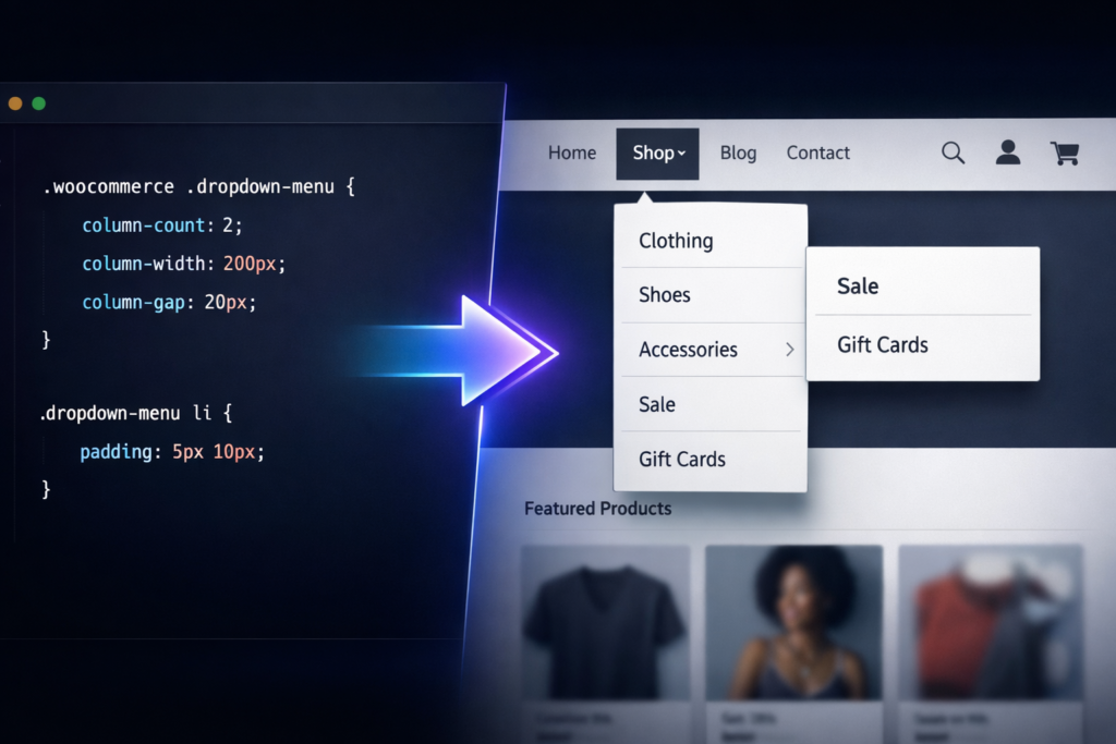
Scroll over “Shop” on a growing WooCommerce store and you’ll often see it: a long, awkward list of categories spilling downward like an unedited grocery receipt. It works — technically. But it doesn’t feel premium. It feels crowded. Overwhelming. A little chaotic.
And that’s the quiet problem many store owners ignore.
As your product range expands, your dropdown menu expands with it. More categories. More subcategories. More scrolling. What was once clean becomes cluttered. Visitors hesitate. They hunt. They miss things. And every extra second of friction is a small leak in your conversion bucket.
This is where a subdivided column menu comes in.
Instead of stacking categories vertically in one long column, you split them into multiple columns inside the dropdown. Two columns. Three columns. Even more if needed. The result? A structured, breathable layout that looks intentional rather than accidental.
It’s not just aesthetic.
A subdivided column menu improves:
- User experience (UX) by reducing visual overload
- Navigation speed by making categories easier to scan
- Conversions by helping customers find products faster
And here’s the part most guides skip: you don’t need a premium mega menu plugin to do this.
While tools like Max Mega Menu offer built-in column features, you can achieve the same multi-column dropdown effect using custom CSS inside your existing WordPress setup. No extra cost. No heavy plugins. Just clean structural styling.
If you’re comfortable pasting CSS into your theme customizer, you already have everything you need.
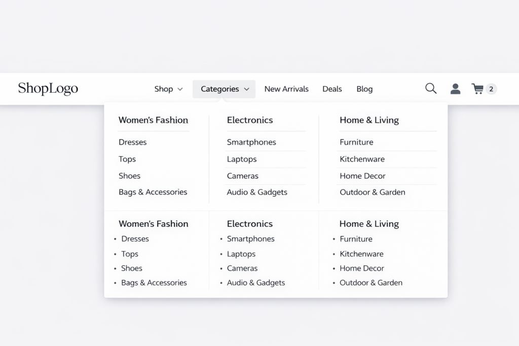
2. What Is a Subdivided Column Menu in WooCommerce?
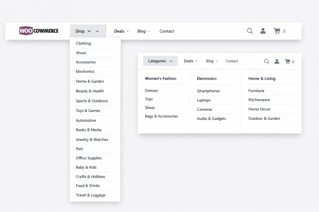
A subdivided column menu is simply a multi-column dropdown inside your main navigation. Instead of displaying submenu items in one vertical list, the items are divided into two or more columns within the same dropdown container.
Think of it as turning this:
Category 1
Category 2
Category 3
Category 4
Category 5
Category 6
Into this:
Category 1 Category 4
Category 2 Category 5
Category 3 Category 6
Cleaner. Faster to scan. Visually balanced.
By default, WooCommerce uses WordPress’s standard menu structure. Submenus appear as a single stacked column beneath a parent item like “Shop.” This works perfectly for small stores with five or six categories.
But once you’re dealing with:
- 15+ product categories
- Deep subcategory hierarchies
- Seasonal collections
- Brand-based filtering
That single column becomes impractical.
Column subdivision makes sense when your dropdown is long enough to require scrolling or visually dominates the screen. At that point, you’re not enhancing navigation — you’re slowing it down.
Now, how is this different from a mega menu plugin?
Mega menu plugins often provide:
- Drag-and-drop column builders
- Icons, images, widgets
- Advanced layout controls
But they also introduce extra scripts, styling conflicts, and sometimes performance overhead.
The manual CSS approach, on the other hand:
- Keeps your setup lightweight
- Works directly with your existing theme
- Targets specific menus only
- Gives you full layout control
It’s minimal. Surgical. Efficient.
You’re not rebuilding your navigation system. You’re simply restructuring how it displays — intelligently.
3. Step 1: Enable CSS Classes in WordPress Menu Settings
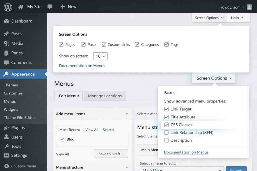
Before you touch a single line of CSS, you need access to something WordPress quietly hides by default: custom menu classes.
This is the control panel moment. The small switch that unlocks precision.
3.1 Navigate to Menu Settings
Head into your WordPress dashboard.
Go to:
Appearance > Menus
This is where your site’s navigation lives — the architecture behind your header.
Once you’re there, look at the top-right corner of the screen. You’ll see a small tab labeled Screen Options.
Click it.
It doesn’t look dramatic. But it’s where the hidden tools are.
3.2 Enable Advanced Menu Properties
Inside Screen Options, you’ll see several checkboxes under “Show advanced menu properties.”
Find and check:
✔ CSS Classes
The moment you enable this, WordPress adds a new field inside every menu item called CSS Classes (optional).
What does this unlock?
It gives you the ability to assign a custom class — like two-columns — to a specific parent menu item. That class becomes your styling hook. Your targeting mechanism. Your way of saying:
Only this dropdown gets transformed. Leave the rest untouched.
Without enabling CSS Classes, you can’t isolate styling. You’d be applying broad CSS that affects every submenu — and that’s rarely what you want.
This small checkbox is the difference between controlled design and accidental chaos.
Now that you’ve activated it, you’re ready to structure the actual menu.
4. Step 2: Set Up Your WooCommerce Product Categories in the Menu
Before you split a submenu into columns, you need something to split.
That means properly adding your WooCommerce product categories into your navigation structure.
4.1 Enable Product Categories
Still inside Appearance > Menus, check the left-hand panel.
If you don’t see Product Categories, click Screen Options again and enable it from the list of available menu items.
This option pulls your categories directly from WooCommerce and makes them selectable inside the menu builder.
Once enabled, you’ll see your product categories listed and ready to be added.
4.2 Add Categories to the Menu
Select the categories you want to appear in your dropdown.
Click Add to Menu.
Now decide where they belong.
Most stores place them under a parent navigation item like:
- Shop
- Store
- Products
If you don’t already have a parent item, create one (for example, a custom link labeled “Shop”).
Then drag your categories underneath it.
4.3 Create a Dropdown Structure
This is where hierarchy matters.
To create a dropdown:
- Drag category items slightly to the right under the parent item.
- This indentation signals they are sub-items.
You’ll visually see them nested under “Shop.”
That indentation = dropdown behavior.
Once your structure looks correct:
Click Save Menu.
Now you have:
Parent Item
→ Nested Product Categories
→ Functioning Dropdown
Clean. Structured. Ready for subdivision.
Only after this hierarchy is properly built should you move to the styling phase. Structure first. Design second.
5. Step 3: Add a Custom CSS Class to the Parent Menu Item
Now we move from structure to precision.
This is where you tell WordPress exactly which dropdown should transform into columns — and which ones should remain untouched.
5.1 Expand the Parent Item
Go back to:
Appearance > Menus
Find your parent menu item — for example:
Shop
Click the small arrow on the right side of the menu item to expand its settings.
Because you enabled CSS Classes earlier, you’ll now see a field labeled:
CSS Classes (optional)
This is your styling anchor.
5.2 Add a Custom Class
Inside the CSS Classes field, enter a class name like:
two-columns
Or, if you prefer something more scalable:
multi-columns
Keep it simple. No spaces. No special characters.
This class will now be attached to the “Shop” menu item — and more importantly, to its dropdown container.
You’ve just created a targeting mechanism.
5.3 Save Changes
Click Save Menu.
Now here’s why this matters:
That custom class allows you to write CSS that affects only this submenu.
Without it, your CSS might style every dropdown across your site. With it, you’re surgically applying layout changes to a single navigation item.
Clean. Controlled. Intentional.
Now we bring it to life with CSS.
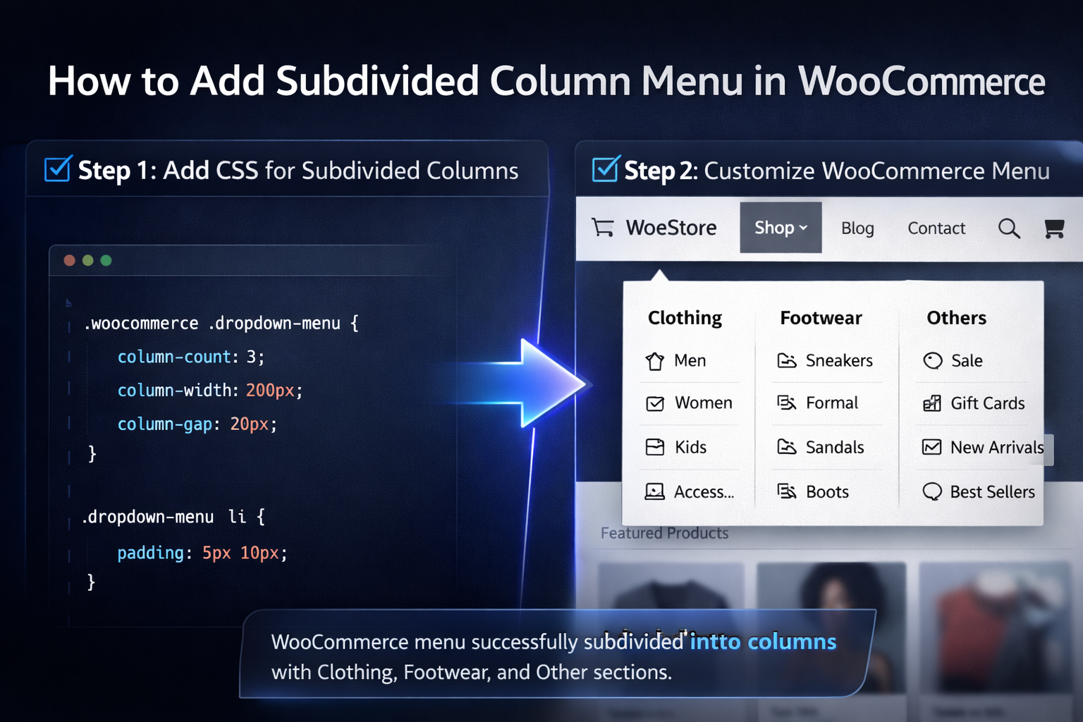
6. Step 4: Add CSS to Create Subdivided Columns
This is where the transformation happens.
You’ve structured the menu.
You’ve added the targeting class.
Now you reshape the layout.
6.1 Where to Add CSS
Go to:
Appearance > Customize > Additional CSS
This is WordPress’s built-in custom styling area. Changes here apply instantly and can be previewed live.
You don’t need a child theme for this basic layout adjustment.
6.2 Basic Two-Column Layout (Desktop Only)
We’ll start with a two-column dropdown.
First, we wrap the styling inside a responsive breakpoint:
@media (min-width: 992px) {
.header .navbar-container .main-menu li.two-columns ul.dropdown-menu > li.menu-item {
width: calc(50% – (var(–wp–preset–spacing–50) / 2));
}
.header .navbar-container .main-menu li.two-columns:hover > .dropdown-menu {
min-width: 460px;
display: flex;
flex-direction: row;
flex-wrap: wrap;
column-gap: var(–wp–preset–spacing–50);
}
}
Let’s break that down:
- min-width: 992px ensures this layout only applies on desktop screens.
- Each submenu item is given roughly 50% width.
- The dropdown becomes a flex container.
- Items wrap into two columns automatically.
- Column spacing is controlled with column-gap.
On mobile, the menu remains stacked — which is usually what you want.
6.3 Adjusting Theme Selectors
Here’s the important part:
The selector
.header .navbar-container .main-menu
may not match your theme.
Every WordPress theme structures navigation differently.
To find your correct selector:
- Open your site in Chrome.
- Right-click the dropdown menu.
- Click Inspect.
- Look at the class names surrounding your menu container.
You’re searching for the main <ul> that contains your dropdown.
Replace the example selector in the CSS with the one your theme uses.
If the CSS doesn’t apply, 90% of the time it’s a selector mismatch.
7. Creating 3 or More Columns
Two columns are clean.
Three columns feel premium.
Four columns start entering mega menu territory.
You have two main approaches.
7.1 Using column-count
If you prefer a simpler method, you can use CSS columns:
@media (min-width: 992px) {
.two-columns ul.sub-menu {
column-count: 3;
column-gap: 20px;
}
}
Here’s what happens:
- column-count: 3; splits the submenu into three vertical columns.
- column-gap controls the spacing between them.
This method is quick and clean, especially for evenly distributed lists.
It works best when you don’t need precise control over individual item widths.
7.2 Using a Flexbox Alternative
If you want more control, use Flexbox and adjust widths manually.
For three columns, you would change:
width: 33.33%;
Or use:
width: calc(33.33% – spacing);
This gives you:
- More predictable wrapping
- Better alignment control
- Cleaner handling for uneven content
Flexbox is more precise.
column-count is faster to implement.
Choose based on your layout needs.
At this point, your WooCommerce dropdown is no longer a long vertical list.
It’s structured. Balanced. Easy to scan.
And you did it without installing a heavy mega menu plugin.
Lean. Powerful. Controlled.
8. Advanced Customization
Once you’ve built your columns, you’ll notice something interesting.
Not all dropdowns are symmetrical.
Not all categories are evenly distributed.
And sometimes… you want control that feels editorial rather than automatic.
This is where refinement begins.
8.1 Asymmetric Column Breaks
Let’s say you want:
- 4 items in the first column
- 6 items in the second
- A clean visual split
Instead of letting the browser decide, you can force a break using :nth-child().
Example:
.two-columns ul.sub-menu li:nth-child(5) {
break-before: column;
}
What this does:
- The fifth item becomes the start of a new column.
- The first four remain in column one.
- Everything after flows naturally.
This gives you surgical control over layout flow — especially useful when categories are grouped logically (e.g., Men’s vs Women’s vs Accessories).
You’re no longer at the mercy of automatic distribution.
You’re directing the layout.
8.2 Controlling Column Width and Spacing
Columns feel professional when they breathe.
If your dropdown looks cramped, adjust:
min-width: 500px;
Increasing min-width ensures the dropdown container expands wide enough to accommodate multiple columns comfortably.
Spacing matters just as much.
With Flexbox:
column-gap: 30px;
With CSS columns:
column-gap: 25px;
The larger the store, the more important spacing becomes. Dense menus feel overwhelming. Balanced spacing feels premium.
Think less spreadsheet.
More storefront.
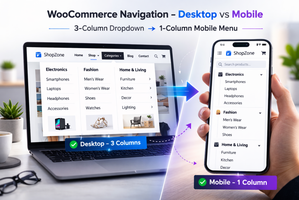
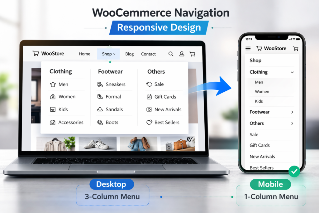
9. Making the Subdivided Menu Responsive
Here’s where many store owners slip.
A beautiful three-column dropdown on desktop can become chaos on mobile.
Why?
Because mobile screens are narrow. Columns compress. Text wraps awkwardly. Tap targets shrink.
That’s why we wrapped our layout inside:
@media (min-width: 992px)
This ensures columns only apply to desktop screens.
On smaller screens, you typically want:
- A single vertical stack
- Full-width tap-friendly items
- Clean spacing
If needed, you can explicitly reset styles for mobile:
@media (max-width: 991px) {
.two-columns ul.sub-menu {
column-count: 1;
display: block;
}
}
In most cases, stacking vertically is the right move. Mobile users scroll naturally. They don’t hover — they tap.
Design accordingly.
10. Troubleshooting Common Issues
Even clean CSS can misbehave. When columns don’t appear as expected, it’s usually one of these:
Columns Not Appearing
Check:
- Did you save the menu after adding the class?
- Is your class name spelled correctly?
- Are you testing on desktop (above 992px)?
Most column layouts are intentionally disabled on smaller screens.
CSS Not Applying
If nothing changes:
- Clear your browser cache.
- Clear any caching plugin.
- Hard refresh (Ctrl + Shift + R).
Still nothing?
Then it’s likely a selector issue.
Selector Mismatch
This is the most common problem.
Every theme structures navigation differently.
If your CSS targets:
.header .navbar-container .main-menu
but your theme uses:
.site-header .primary-menu
The styling won’t apply.
Use browser Inspect to locate the exact <ul> class structure and update your selectors accordingly.
Precision wins here.
Layout Breaking in Specific Themes
Some themes:
- Apply overflow: hidden;
- Restrict dropdown width
- Force fixed widths on submenu items
If columns overlap or overflow:
- Increase min-width
- Override restrictive width rules
- Check for conflicting CSS inside the theme stylesheet
Themes sometimes fight back. You just need to override intelligently.
11. Alternative: Using a Mega Menu Plugin
Sometimes, CSS reaches its limits.
If you need:
- Icons inside dropdowns
- Images or banners
- Custom widgets
- Drag-and-drop column control
Then a mega menu plugin may be the better route.
No-code solutions simplify layout management and reduce manual CSS adjustments.
One popular example is Max Mega Menu.
It allows you to:
- Create multi-column layouts visually
- Add rich content blocks
- Customize styling inside WordPress
The trade-off?
More scripts.
More styling layers.
Potential performance overhead.
If you want lightweight control and understand CSS, manual styling is powerful.
If you want visual building and advanced layout components, a plugin can accelerate the process.
Choose based on complexity — not convenience alone.
12. Key Resources
If you want to go deeper — or double-check specific implementations — these resources expand on different parts of the process.
1. WordPress.org Forum Thread
A practical CSS snippet discussion where users share real-world solutions for dividing submenus into multiple columns.
→ WordPress.org Support Thread
2. FlyWithWP Tutorial
A focused walkthrough specifically explaining subdivided column menus in WooCommerce using CSS.
→ FlyWithWP Guide
3. SevenSpark Guide
Explains how to properly add custom CSS classes to WordPress menu items — a critical step in isolating styling.
→ SevenSpark Tutorial
4. Stack Overflow Discussion
Technical insight into using column-count for WordPress submenu layouts. Helpful for understanding CSS column behavior.
→ Stack Overflow Thread
These aren’t required to complete the setup — but they’re useful if you want to refine edge cases or explore alternative approaches.
13. Related Guides (Follow-Up Articles)
Once you’ve implemented a subdivided column menu, you’ll likely want to expand its functionality. These are natural next steps:
- How to Make Subdivided Menu Mobile Responsive in WooCommerce
Deep dive into breakpoint strategy, tap behavior, and mobile UX adjustments. - Elementor-Specific CSS for WooCommerce Mega Menu Columns
How to adjust selectors and structure when using Elementor’s header builder. - Asymmetric Column Breaks in WooCommerce Submenus
Advanced layout control using :nth-child() and manual column balancing. - PHP Code to Add Column Classes to WooCommerce Menus
Automating class injection directly via theme functions instead of manual entry. - Common Issues Fixing WooCommerce Menu Column Layout
Debugging theme conflicts, overflow issues, and broken dropdown widths.
Each of these topics builds on the same principle: structured navigation equals better usability.
14. Conclusion
Let’s zoom out.
You started with a long, cluttered dropdown menu.
You:
- Enabled CSS Classes in WordPress
- Structured your WooCommerce categories properly
- Added a custom targeting class
- Applied responsive CSS
- Split your submenu into clean, readable columns
No premium plugin required.
No bloated mega menu system.
Just intentional layout control.
That’s the real takeaway here.
You’re not just styling a dropdown.
You’re designing navigation that respects attention.
And if you’re not deeply technical? That’s fine.
You didn’t modify core files.
You didn’t touch PHP.
You used built-in WordPress tools and small, controlled CSS adjustments.
Before pushing changes live, always test safely:
- Set up a staging environment through your hosting provider
- Or use a staging plugin to preview changes privately
For official WooCommerce documentation and setup guidance, you can also refer to:
→ WooCommerce Documentation
Build carefully.
Test deliberately.
Deploy confidently.
Because better navigation isn’t cosmetic — it’s commercial.
Frequently Asked Questions
1. Do I need a plugin to create a subdivided column menu in WooCommerce?
No. You can create a multi-column dropdown using custom CSS inside WordPress without installing any additional plugins. While plugins like Max Mega Menu offer visual builders and advanced features, a clean CSS approach is often lighter, faster, and more controlled.
If your goal is simple column subdivision — CSS is enough.
2. Will this affect my mobile menu layout?
Not if you apply the correct responsive breakpoint.
By wrapping your column styles inside a @media (min-width: 992px) rule, the multi-column layout only activates on desktop screens. On mobile devices, the menu remains stacked vertically — which is usually better for tap navigation and readability.
Always test across devices before publishing.
3. What if the columns don’t appear after adding the CSS?
The most common issue is a selector mismatch.
Every WordPress theme structures navigation differently, so the example CSS selectors may need adjustment. Use your browser’s Inspect tool to locate your theme’s actual menu class structure and update the CSS accordingly.
Also double-check that:
- The custom class is added to the correct parent menu item
- The menu is saved
- Cache is cleared
4. Can I create uneven or custom column breaks?
Yes.
You can use :nth-child() along with break-before: column; to manually control where a new column begins. This is especially useful when grouping categories logically — for example separating product types by audience or collection.
This gives you editorial-level control over how items flow inside the dropdown.
5. Is this method compatible with all WooCommerce themes?
In most cases, yes — because you’re styling existing markup rather than modifying core files.
However, some themes may:
- Restrict dropdown width
- Apply fixed submenu styling
- Use different class structures
In those cases, small CSS adjustments will be needed.
The core functionality of WooCommerce remains unaffected, since you’re only changing presentation — not logic or product data.


