

-
- No Comments
- February 4, 2026
Mobile SEO optimization techniques
1. Introduction: Why Mobile SEO Is No Longer Optional
Mobile search isn’t the future it’s the default. With over 70% of all searches now happening on smartphones, users expect websites to load instantly, read effortlessly, and work flawlessly on smaller screens. If your site struggles on mobile, rankings slip, bounce rates spike, and conversions quietly disappear.
Google’s response to this shift is mobile-first indexing. In simple terms, Google now primarily uses the mobile version of your website to decide how you rank even for desktop search results. That means a slow, cluttered, or incomplete mobile experience can drag down your entire SEO performance, no matter how polished your desktop site looks.
In this guide, you’ll learn exactly how to optimize your site for mobile SEO from responsive design and page speed to user experience, content structure, and indexing best practices so your pages don’t just survive mobile search, but dominate it.
2. What Is Mobile SEO Optimization?
Mobile SEO optimization is the process of improving a website’s visibility, usability, and performance specifically for users on mobile devices. It ensures that pages load fast, display correctly on smaller screens, and deliver content that’s easy to read, tap, and navigate while remaining fully crawlable and indexable by search engines.
Unlike desktop SEO, mobile SEO prioritizes:
- Page speed over visual complexity
- Vertical scrolling over multi-column layouts
- Touch interaction over mouse navigation
- Readability over dense content blocks
The most critical factor tying everything together is mobile-first indexing. Because Google evaluates your site based on its mobile version, elements like hidden content, slow load times, or broken mobile layouts directly impact rankings. In short: your mobile site is your main site in Google’s eyes.
3. Core Principles of Mobile SEO (Foundation Layer)
3.1 Responsive Web Design (Google’s #1 Recommendation)
Responsive web design uses one URL and one HTML structure for all devices, adapting the layout dynamically through CSS based on screen size. This approach allows your website to serve the same content to mobile, tablet, and desktop users just styled differently for each screen.
Instead of managing separate mobile and desktop versions, responsive design:
- Simplifies crawling and indexing
- Prevents duplicate content issues
- Consolidates ranking signals to a single URL
From Google’s perspective, responsive design is the cleanest, safest, and most future-proof setup for mobile SEO.
3.2 Viewport Configuration
The viewport tells a browser how to scale and display your content on mobile screens. Without a properly configured viewport meta tag, pages may appear zoomed out, distorted, or impossible to read on smartphones.
A correctly implemented viewport ensures:
- Text scales naturally without pinching or zooming
- Layouts fit within screen width
- Images and elements don’t overflow horizontally
Common mobile SEO issues include fixed-width layouts, missing viewport tags, and elements that force horizontal scrolling each of which damages user experience and engagement metrics.
3.3 Content Parity Between Mobile & Desktop
Content parity means mobile users see the same meaningful content as desktop users not a stripped-down or hidden version. With mobile-first indexing, Google evaluates your rankings based on what’s visible and accessible on mobile.
If important text, links, or structured data are hidden behind accordions, tabs, or truncated sections, you risk:
- Reduced keyword relevance
- Incomplete indexing
- Lower rankings compared to competitors
The rule is simple: if it matters for SEO, it must be visible and accessible on mobile preferably above the fold.
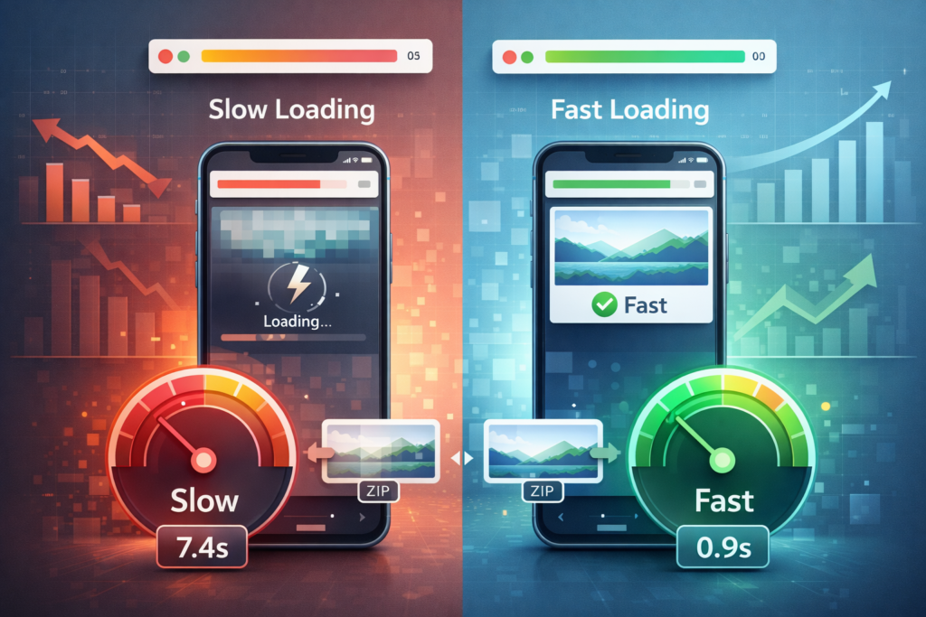
4. Mobile Page Speed Optimization Techniques

Page speed is the backbone of mobile SEO. On smartphones, users expect pages to load in under three seconds and Google rewards sites that meet that expectation with better rankings and lower bounce rates. Speed optimization isn’t a single fix; it’s a system.
4.1 Image Optimization for Mobile
Images are often the heaviest elements on mobile pages and the easiest to optimize.
WebP format usage
WebP images are significantly smaller than JPEG or PNG files while maintaining high visual quality. Switching to WebP reduces page weight, improves load times, and directly boosts mobile performance scores without sacrificing design.
Lazy loading strategy
Lazy loading ensures images load only when they’re about to enter the user’s viewport. This prevents off-screen images from slowing down initial page load and improves perceived performance especially on long, scroll-heavy mobile pages.
4.2 Code & Asset Optimization
Bloated code slows everything down on mobile, particularly on weaker networks and lower-end devices.
Minifying CSS, JS, and HTML
Minification removes unnecessary characters, comments, and whitespace from code files. Smaller files mean faster downloads and quicker rendering, which directly improves mobile speed metrics.
Browser caching basics
Browser caching allows returning users to load pages faster by storing static resources like images, CSS, and scripts locally on their device. Proper cache headers reduce repeat load times and server requests.
Deferring non-critical JavaScript
Not all scripts need to load immediately. Deferring non-essential JavaScript prevents render-blocking, allowing visible content to load first crucial for improving initial mobile load speed.
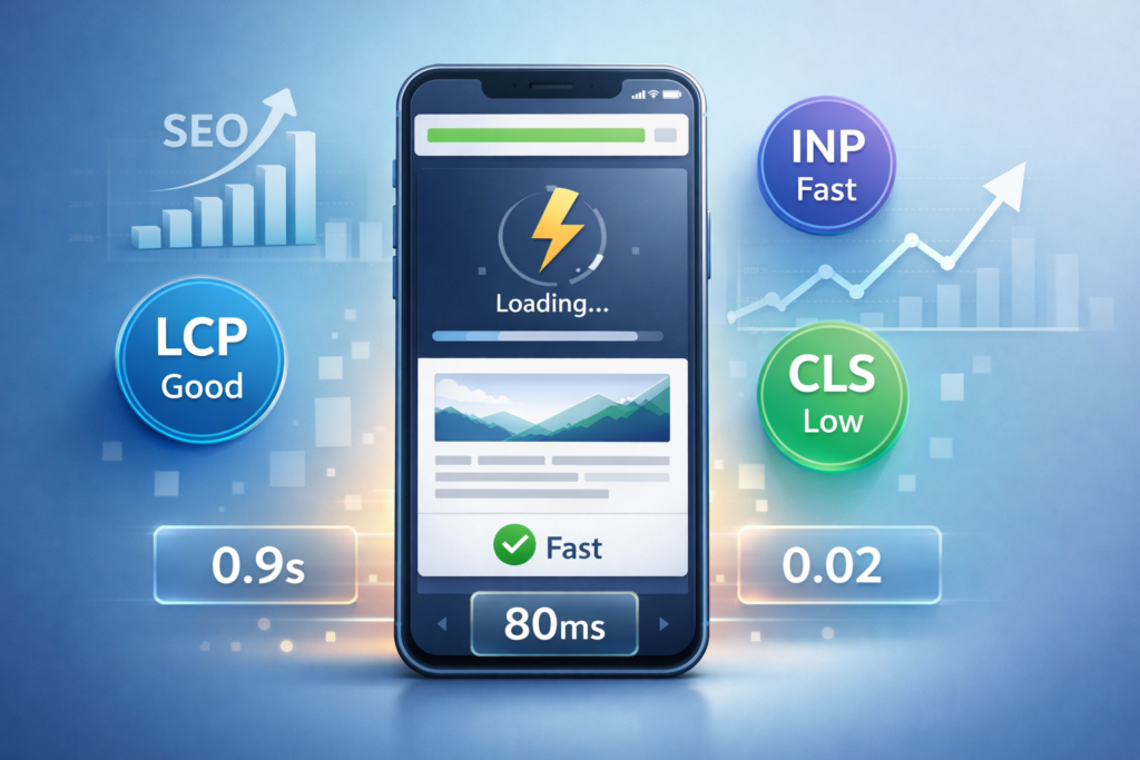
4.3 Core Web Vitals for Mobile SEO
Core Web Vitals measure real-world mobile performance, not theoretical speed.
Largest Contentful Paint (LCP)
LCP measures how quickly the main content loads. For strong mobile SEO, LCP should occur within 2.5 seconds. Optimizing hero images, reducing server response time, and minimizing render-blocking resources are key.
Interaction to Next Paint (INP)
INP evaluates how responsive your site feels when users tap, scroll, or interact. A good mobile INP score stays under 200 milliseconds, achieved by reducing heavy JavaScript and improving event handling.
Cumulative Layout Shift (CLS)
CLS tracks visual stability. Unexpected layout shifts like buttons jumping during load frustrate mobile users. A CLS score below 0.1 ensures a stable, predictable experience by reserving space for images, ads, and dynamic elements.
4.4 Global Performance Enhancements
CDN usage for international audiences
A Content Delivery Network (CDN) serves your site’s assets from servers closest to the user’s location. For global mobile audiences, CDNs dramatically reduce latency, improve load times, and stabilize performance across regions and networks.
5. Mobile User Experience (UX) Fixes That Impact SEO

Mobile SEO isn’t just about speed it’s about how easily humans can use your site. Google tracks user behavior closely, and poor UX quietly erodes rankings.
5.1 Touch & Navigation Design
Thumb-friendly tap targets
Mobile users navigate with thumbs, not cursors. Tap targets should be at least 48×48 pixels, ensuring links and buttons are easy to press without misclicks.
Button spacing standards
Adequate spacing around 8 pixels or more between interactive elements prevents accidental taps and improves usability, especially on smaller screens.
5.2 Readability on Small Screens
Font size best practices
Mobile body text should start at 16px or larger to avoid zooming. Clear typography improves readability and keeps users engaged longer.
Paragraph length & white space
Short paragraphs of 2–3 sentences, combined with generous white space, make content easier to scan and digest on mobile devices reducing bounce rates and increasing dwell time.
5.3 Mobile CTA Optimization
Click-to-call placement
For mobile users, click-to-call CTAs remove friction. Placing them prominently allows instant action especially for local or service-based searches.
Thumb-zone CTA positioning
CTAs perform best when placed within natural thumb zones, typically near the bottom center of the screen. This positioning increases tap rates without interrupting content flow.
5.4 Pop-Ups, Interstitials & UX Penalties
What Google considers intrusive
Google penalizes mobile pages that display pop-ups or interstitials covering more than one-third of the screen, especially if they block content immediately after landing.
Safe alternatives for mobile conversions
Use lightweight banners, slide-ins, or inline CTAs instead. These methods capture attention without disrupting the user experience or risking ranking penalties.
6. Mobile Content Optimization Strategies

Great mobile SEO content isn’t just well-written it’s designed for small screens, fast scanning, and instant intent matching. The goal is clarity first, depth second, and friction never.
6.1 Mobile-Optimized Titles & Meta Descriptions
Character limits
Mobile SERPs truncate aggressively. Titles perform best at 50–60 characters, while meta descriptions should stay around 150–155 characters to avoid cut-offs and ellipses.
Keyword placement strategy
Primary keywords should appear as close to the beginning of the title as possible. This improves relevance signals and increases click-through rates, especially on narrow mobile displays where every character counts.
6.2 Scannable Content Formatting
Headings, bullet points, and short blocks
Mobile users don’t read they scan. Break content into clear sections using descriptive headings, bullet lists, and compact text blocks. This structure improves engagement and helps search engines understand content hierarchy.
Above-the-fold content importance
Key information should appear before the first scroll. Mobile-first indexing prioritizes what users see immediately, so introductions, headings, and core answers must load fast and stay visible without interaction.
6.3 Voice Search Optimization
Natural language phrasing
Voice searches are conversational. Optimizing content with natural, spoken language helps match how users phrase questions when talking to their devices.
Question-based content structure
Using direct questions as subheadings followed by concise answers increases the chance of appearing in voice results and featured snippets, especially for mobile users searching on the go.
6.4 Schema Markup for Mobile SERPs
FAQ schema
FAQ schema enhances visibility by displaying expandable answers directly in mobile search results, increasing screen real estate and click-through rates.
LocalBusiness schema
For mobile local searches, LocalBusiness schema helps Google surface accurate business details like address, hours, and contact information critical for “near me” queries.
Rich result visibility benefits
Structured data improves eligibility for rich results, which dominate mobile SERPs and often capture attention before traditional blue links.
7. Technical Mobile SEO Checklist
Technical precision is what allows great mobile content to actually rank. Even small configuration errors can undermine mobile-first indexing.
7.1 Crawling & Indexing Controls
Robots.txt for CSS, JS, images
Google must be able to crawl all essential resources. Blocking CSS, JavaScript, or images prevents proper rendering and can result in misjudged mobile usability.
Noindex errors to avoid
Accidentally applying noindex tags to mobile pages can remove them from search results entirely a common but costly mobile SEO mistake.
7.2 Canonical & URL Handling
Canonical setup for mobile vs desktop
For responsive sites, a single canonical URL is sufficient. For separate mobile URLs, desktop pages should point to themselves as canonical, with mobile pages marked as alternates.
Alternate URLs & hreflang use cases
In multi-language or multi-region setups, hreflang ensures the correct mobile version is shown to the right audience without causing duplication or ranking conflicts.
7.3 XML Sitemaps for Mobile Pages
Separate vs combined sitemaps
Mobile pages can be included in a single sitemap or split into dedicated mobile sitemaps. The key is consistency every important mobile URL must be discoverable and up to date.
7.4 Ads & Mobile Compliance
Better Ads Standards
Ads should not disrupt content flow or overwhelm the screen. Following Better Ads Standards ensures monetization doesn’t come at the cost of rankings.
Interstitial penalties explained
Full-screen pop-ups that block content immediately after page load can trigger ranking penalties. Mobile-friendly alternatives include inline CTAs or delayed, minimal overlays.
8. Advanced Mobile SEO Techniques
Once the fundamentals are solid, advanced mobile SEO techniques help you outperform competitors, capture high-intent traffic, and future-proof your visibility as mobile SERPs continue to evolve.
8.1 Progressive Web Apps (PWAs)
SEO benefits
Progressive Web Apps combine the reach of the web with the experience of a native app. PWAs load faster, work reliably across devices, and improve engagement metrics signals Google associates with high-quality mobile experiences.
Offline access & engagement
With service workers, PWAs can cache content for offline use, allowing users to access pages even on unstable mobile networks. This reliability boosts session duration, repeat visits, and overall mobile satisfaction.
8.2 Accelerated Mobile Pages (AMP)
When AMP still makes sense
AMP can still be valuable for content-heavy sites like news publishers or blogs that rely on instant loading and visibility in mobile carousels.
Post-2021 relevance
Since Google removed AMP as a ranking requirement, its use is optional. Performance gains once exclusive to AMP can now be achieved through strong Core Web Vitals optimization, making AMP a strategic not mandatory choice.
8.3 Local Mobile SEO Optimization
NAP consistency
Ensuring consistent Name, Address, and Phone number details across your website and directories builds trust and improves local mobile rankings.
Google Business Profile optimization
An optimized Google Business Profile increases visibility in mobile search, maps, and local packs. Accurate categories, photos, and updates directly influence mobile discovery.
“Near me” search intent
Mobile users frequently search with location-based intent. Optimizing content and metadata for “near me” queries helps capture high-conversion local traffic.
8.4 Zero-Click & SERP Feature Optimization
Featured snippets
Structured, concise answers increase the likelihood of appearing in featured snippets often the first result mobile users see.
Local packs & mobile SERP behavior
Mobile SERPs prioritize local packs, maps, and interactive elements. Optimizing for these features ensures visibility even when users don’t scroll to traditional organic listings.
9. Monitoring & Measuring Mobile SEO Performance
Mobile SEO is not a one-time task it’s a continuous process of testing, measuring, and refining.
9.1 Google Search Console (Mobile Reports)
Mobile usability issues
Search Console flags common problems like clickable elements being too close, content wider than the screen, or unreadable text each of which impacts mobile rankings.
Mobile-first indexing status
The mobile-first report confirms whether Google is indexing your site based on its mobile version and highlights any discrepancies affecting performance.
9.2 Performance Testing Tools
PageSpeed Insights
PageSpeed Insights evaluates real-world and lab data, offering actionable recommendations to improve mobile Core Web Vitals.
Lighthouse
Lighthouse audits mobile performance, accessibility, and best practices, making it ideal for diagnosing deeper UX and speed issues.
Mobile-Friendly Test
This tool verifies whether a page meets Google’s mobile usability standards and identifies rendering or interaction issues.
9.3 SEO Tools for Mobile Rankings
Ahrefs
Ahrefs allows mobile-specific keyword tracking and competitive analysis, helping identify ranking gaps and opportunities.
SEMrush
SEMrush provides mobile position tracking, site audits, and visibility reports tailored to mobile SERPs.
Mobile keyword tracking
Monitoring keyword performance separately for mobile reveals shifts in intent, competition, and visibility that desktop tracking often misses.
10. Common Mobile SEO Mistakes to Avoid (2026 Edition)
Even well-optimized sites lose rankings due to small but critical mobile SEO errors. In a mobile-first ecosystem, these mistakes are no longer minor they’re costly.
Hidden content in accordions
While accordions can improve UX, hiding important keyword-rich content or internal links behind collapsed sections reduces visibility. If content matters for SEO, it must be easily accessible on mobile preferably without extra taps.
Slow-loading media
Uncompressed images, oversized videos, and auto-playing media cripple mobile load times. These elements inflate LCP scores, frustrate users on slower networks, and silently damage rankings.
Poor font scaling
Text that’s too small forces users to pinch and zoom an immediate usability red flag. Mobile pages should use readable font sizes and responsive typography to maintain clarity across devices.
Intrusive interstitials
Pop-ups that block content immediately after page load or cover large portions of the screen trigger ranking penalties. Google prioritizes unobstructed access on mobile, especially for informational content.
Broken mobile canonicals
Incorrect canonical tags especially on sites with separate mobile URLs confuse search engines and dilute ranking signals. Every mobile page must correctly reference its canonical counterpart to maintain indexing integrity.
11. Mobile SEO Case Studies & Real-World Impact
Mobile SEO isn’t theoretical it delivers measurable results when executed correctly.
Ranking improvements after mobile optimization
Sites that improve mobile speed, usability, and content structure frequently see upward ranking shifts within weeks, particularly for competitive mobile-heavy keywords.
Traffic and bounce rate changes
Optimized mobile pages load faster and read better, leading to lower bounce rates and longer session durations two strong engagement signals tied to search performance.
Conversion gains on mobile-first sites
From click-to-call actions to form submissions, mobile-first optimization increases conversions by reducing friction and aligning layout with user intent. Faster, cleaner mobile experiences consistently outperform desktop-heavy designs.
12. How to Measure Mobile SEO Success
Success in mobile SEO is defined by performance, visibility, and user behavior, not rankings alone.
Core Web Vitals benchmarks
Strong mobile SEO sites maintain LCP under 2.5 seconds, INP below 200 milliseconds, and CLS under 0.1 ensuring speed, responsiveness, and visual stability.
CTR improvements
Optimized titles, descriptions, and rich results increase click-through rates on mobile SERPs, where screen space is limited and competition is intense.
Engagement metrics in Google Analytics
Metrics like average engagement time, scroll depth, and conversion rate reveal how well your mobile experience satisfies user intent making them essential indicators of long-term SEO success.
13. Recommended Tools for Mobile SEO Optimization
The right tools turn mobile SEO from guesswork into precision. These platforms help diagnose issues, measure progress, and maintain performance as algorithms evolve.
Core Web Vitals tools
- Google PageSpeed Insights – Evaluates real-world mobile performance and highlights LCP, INP, and CLS issues with clear improvement suggestions.
- Lighthouse – Provides in-depth mobile audits covering performance, accessibility, and best practices.
- Chrome DevTools (Performance Tab) – Ideal for identifying render-blocking resources and JavaScript bottlenecks on mobile.
UX testing tools
- Google Mobile-Friendly Test – Confirms whether pages meet Google’s mobile usability standards.
- Hotjar / Microsoft Clarity – Heatmaps and session recordings reveal where mobile users struggle or drop off.
- BrowserStack – Tests real mobile devices and screen sizes without relying on emulators.
Technical audit platforms
- Google Search Console – Essential for mobile usability reports, indexing status, and crawl diagnostics.
- Ahrefs – Identifies mobile ranking gaps, technical issues, and competitor performance.
- SEMrush – Combines mobile position tracking with site audits and Core Web Vitals insights.
14. Resource Hub (Outbound Links Section)
Use these authoritative resources to deepen understanding and stay aligned with best practices:
- Google’s Official Mobile SEO Guide
https://developers.google.com/search/mobile-sites/mobile-seo - Mobile SEO Best Practices (2026)
https://www.resultfirst.com/blog/seo-basics/mobile-seo-guide/ - Core Web Vitals Deep Dive
https://www.marketingprofs.com/articles/2025/52795/mobile-seo-best-practices-mobile-first-indexing - Comprehensive Mobile SEO Checklist
https://increv.co/academy/mobile-seo-guide/
15. Final Thoughts: Future-Proofing Your Site for Mobile Search
Mobile-first thinking wins long-term because it aligns with real user behavior. Smartphones are now the primary gateway to search, discovery, and conversion and search engines reward sites that meet users where they are.
The most successful mobile strategies treat SEO, UX, and performance as one unified system. Speed improves experience. Experience improves engagement. Engagement reinforces rankings. When these elements work together, mobile SEO stops being a checklist and becomes a competitive advantage.
Future-proofing your site isn’t about chasing algorithms it’s about building fast, usable, and accessible experiences that naturally earn visibility. In a mobile-first world, that’s not just smart SEO. It’s survival.
Frequently Asked Questions (FAQ)
1. What is mobile SEO optimization?
Mobile SEO optimization is the process of improving a website’s performance, usability, and visibility on mobile devices. It focuses on speed, responsive design, content accessibility, and Core Web Vitals to align with Google’s mobile-first indexing.
2. Why is mobile-first indexing important for SEO?
Mobile-first indexing means Google primarily uses the mobile version of your site for ranking and indexing. If your mobile experience is slow, incomplete, or poorly optimized, your rankings can drop even for desktop searches.
3. How does page speed affect mobile SEO?
Page speed directly impacts rankings, bounce rates, and user engagement on mobile. Faster-loading pages improve Core Web Vitals scores, keep users on-site longer, and increase the likelihood of higher search visibility.
4. Are responsive websites better than separate mobile sites?
Yes. Google recommends responsive design because it uses a single URL and HTML structure for all devices, simplifying crawling, indexing, and ranking while avoiding duplicate content issues.
5. What tools should I use to monitor mobile SEO performance?
Key tools include Google Search Console for mobile usability and indexing, PageSpeed Insights and Lighthouse for Core Web Vitals, and SEO platforms like Ahrefs or SEMrush for mobile keyword tracking.


